Compelling Headlines
Grab Attention Immediately
One of the first things I learned in sales page creation is that the headline is crucial. It acts like a magnet, pulling in potential customers. If your headline doesn’t grab attention, the rest of the page could be the best sales pitch ever written, but nobody’s going to see it!
I often experiment with different phrasing, playing around with questions, bold statements, or even humor. What works best can depend on the audience, so testing is key. You’d be surprised how a slight tweak can either skyrocket your conversions or fall flat.
To really hone in on effective headlines, I recommend checking out your competitors or even some high-performing blogs. What are they doing that seems to work? Use that as inspiration, but don’t copy. Make it your own.
Address Pain Points
People are drawn to solutions. They’re looking for ways to ease their pain, solve their problems, or fulfill their desires. That’s why, in my experience, incorporating pain points into your headline can boost engagement significantly. You’re not just offering a product; you’re offering relief.
When crafting your headlines and subheadings, openly discuss what people struggle with. For instance, if you’re selling a productivity tool, mention how chaotic life can be and how your product can simplify it. Relatability creates connection and a drive to keep reading.
Keep in mind, though, that while addressing pain points, it’s vital not to dwell too much on negativity. Balance those issues with a positive spin on how your service or product offers a way out.
Use Powerful Words
Using powerful words in your headlines can create an emotional reaction that’s hard to ignore. Words like “proven,” “exclusive,” “limited,” and “guaranteed” can spark curiosity or a sense of urgency. I’ve seen firsthand how a well-placed word can completely change the tone and appeal of a sales page.
In my own sales pages, I’ve taken the time to build a vocabulary list that resonates with my target audience. It’s about knowing their language and what gets them excited. Combining this knowledge with persuasive words leads to improved engagement rates.
But remember to stay authentic—using over-the-top phrases can come off as insincere, especially if your product doesn’t hold up. Authenticity and strong language are a winning pair that can drive conversions.
Engaging Copy
Tell a Story
Everyone loves a good story, right? I cannot stress enough how powerful storytelling is on a sales page. It’s a way for customers to see themselves in the narrative and understand how the product or service fits into their lives.
When I write engaging copy, I tend to share relatable anecdotes or customer experiences. This not only humanizes the product, but it also builds credibility and trust. If they can see how your product has made a tangible difference for someone else, they may be more inclined to make a purchase.
Make sure your story has a clear arc—identify the problem, showcase the solution (your product), and highlight the success. This structure keeps the reader engaged and leads them naturally toward the call to action.
Keep It Conversational
Your sales page doesn’t have to read like a textbook. I’ve found that keeping the tone conversational makes it easy for readers to relate. Use ‘you’ and ‘I’; break the fourth wall. This makes the reader feel like they’re having a one-on-one conversation with you, rather than being subjected to a hard sell.
Make use of plain language and avoid jargon or overly complex phrases. Remember, the more accessible your writing, the easier it is for your audience to understand what you’re offering and why they need it.
Additionally, sprinkling in some humor or personality can help keep the engagement levels high. If you’re sincere and relatable, people will be more likely to trust you, which is crucial in making sales.
Use Formatting Strategically
Ever been to a sales page that looks like a giant wall of text? Yeah, me too, and I usually bounce right out of there. That’s why formatting is a game-changer! I always make sure to use short paragraphs, bullet points, and headers to break up the content. This not only makes it easier to read but also helps emphasize key points.
Also, don’t forget about white space. A page that feels overly cluttered can overwhelm potential buyers. A clean design creates a flow that encourages visitors to stay and explore.
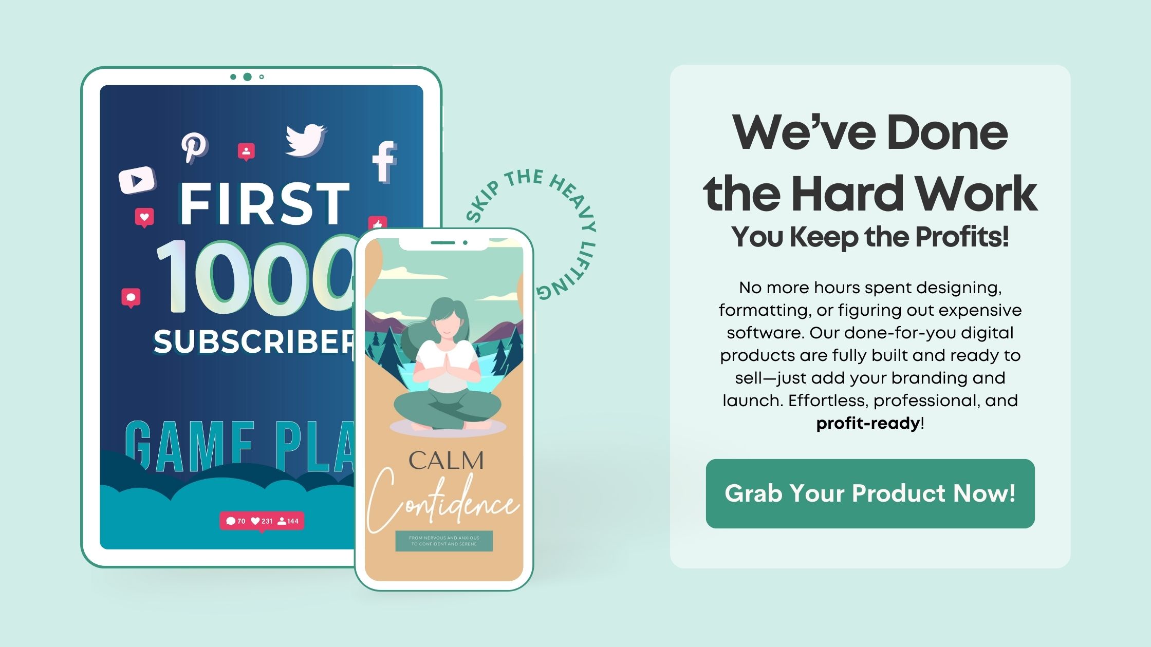
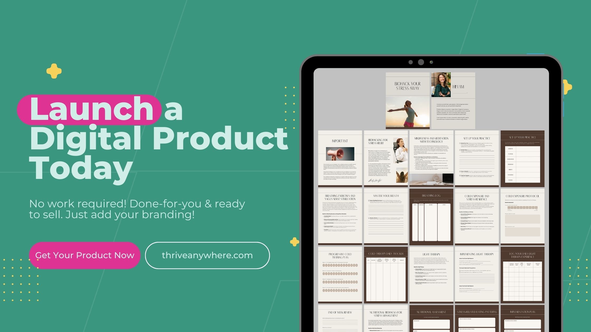
Lastly, including images or videos can enhance the appeal of your copy. Visuals are engaging and can help convey your message quicker than text alone can. Just ensure they are relevant and high quality, of course.
Clear Call to Action
Make It Compelling
Your call to action (CTA) is arguably one of the most critical parts of your sales page. It’s where you directly ask users to take a specific action, whether that’s to buy a product, sign up for a newsletter, or download an eBook. In my practice, I’ve learned that a compelling CTA can be the difference between a missed opportunity and a sale.
The key is to make your CTA clear and inviting. Use action-oriented language. Instead of “Submit,” try “Get Your Free Trial” or “Start Your Journey.” Your CTA should inspire a sense of urgency or a fear of missing out, but it must also feel rewarding.
Testing different phrases for your CTA regularly helps identify what resonates best with your audience. A little change in wording can lead to significant upticks in conversion rates!
Visibility Matters
A fantastic call to action won’t do much good if it’s buried! I always prioritize the placement of my CTAs, making sure they’re visible and accessible without having to scroll excessively. CTAs should be strategically placed throughout the sales page, especially after persuasive sections.
Consider using contrasting colors to make the button stand out. A bold design keeps the focus on the action you want the reader to take. A little bit of visual flair can go a long way in drawing the eye!
Ask yourself, “Is my CTA easy to find?” Take a step back and look at it from a new visitor’s perspective. If it’s not immediately obvious, then you might need to rethink its design or placement.
Reassure with Trust Signals
A well-crafted CTA often reassures customers before they take the plunge. This is where trust signals come into play. Including testimonials, reviews, or media coverage can help set positive expectations and ease any concerns potential buyers might have.
When I showcase authentic testimonials, I use specific examples or customer names to enhance credibility. Seeing real-life experiences makes a huge impact on someone’s decision-making process.
Additionally, including secure checkout badges or money-back guarantees can spark newfound confidence. If they know they’re protected, they’re much more likely to go ahead and click that button!
Effective Visuals
High-Quality Images
Visual appeal plays a huge role in the effectiveness of your sales page. I’ve found that using high-quality images not only enhances your site’s aesthetic but also showcases your product better than words ever could. Think about it – people buy with their eyes first!
Investing in professional photography or using a graphic designer to create stunning visuals is worth it. Crappy images can detract from even the most brilliantly crafted copy. Each visual is like a silent salesperson, so make sure it speaks well!
Also, use images that align with your branding. Consistency in color scheme and style reinforces your brand identity and is key to establishing trust with your audience.
Videos for Impact
Videos can significantly enhance engagement on a sales page. In my experience, including an engaging product demonstration or a quick behind-the-scenes video can bring your product to life. Customers love to see how something works in action; it helps visualize its benefits.
These days, potential buyers appreciate transparency and authenticity. Using video introduces a personal touch that static images just can’t match. A casual talk or live demo can make a big difference in how your product is perceived.
Don’t forget to keep your videos short and sweet. Attention spans are shrinking, so get to the point quickly while still providing value. After all, you want them back to reading your fantastic sales copy!
Ensure Responsive Design
With so many users browsing on mobile devices, ensuring your sales page looks good on all platforms is essential. I’ve seen pages that look great on desktop but feel clunky or unaccessible on mobile, leading to frustrated users and lost sales.
Make sure your visuals and copy adapt beautifully. Responsive design is crucial for keeping your audience engaged, regardless of their device! Test, adjust, and optimize frequently to ensure that any technical hiccups don’t hinder user experience.
Creating a seamless experience leads to a higher likelihood of conversion. Customers will appreciate a smooth, hassle-free process, which ultimately leads to satisfaction and loyalty.
Testing and Optimization
A/B Testing
A/B testing is one of the most important strategies I’ve used to improve sales page conversions. This method allows you to test different versions of your sales page to see which one performs better. From copy changes to visual updates, small adjustments can lead to big results.
Over the years, I’ve learned not to get overly attached to my original version. It’s easy to think that because you love something, everyone else will too, but that’s not always the case. Data doesn’t lie! Monitor which version yields higher engagement and conversions.
Remember, the goal is to find what resonates best with your audience. Even minute changes can lead to increased revenue, so be patient and methodical with A/B testing.
Gather Feedback
Getting feedback is another crucial element when striving to improve your sales page. Sometimes you’re too close to your work to see the flaws. Asking others for their honest opinion can provide invaluable insights.
I often reach out to peers, mentors, or even loyal customers. Fresh eyes can spot things that I may have overlooked, from confusing language to design elements that don’t quite fit.
Don’t shy away from criticism—embrace it! Use their suggestions to refine your approach. The goal is to ensure that your sales page serves your audience effectively.
Monitor Analytics
Finally, dive into your analytics! Tracking data points like bounce rate, conversion rate, and user journey provides a treasure trove of information on how well your sales page is performing. I love using tools like Google Analytics to see what’s working and what’s not.
Regularly reviewing this data allows me to make informed decisions about where changes are needed. For instance, if I notice a high bounce rate, it may indicate people aren’t finding what they expect upon landing on the page.
Analytics isn’t a one-and-done process; it’s ongoing. As trends and audience behaviors evolve, so should your sales page. Staying on top of this helps maintain performance over time.
FAQs
What is the most important element for a sales page?
In my opinion, the headline is the most crucial element. It’s the first thing your potential customer sees, and if it doesn’t grab their attention, they’re likely to leave immediately.
How can I make my sales copy more engaging?
Try telling a story that resonates with your audience. Relatable narratives can draw people in and keep them engaged throughout your sales pitch.
What types of visuals work best on a sales page?
High-quality images and engaging videos are vital. They help showcase your product effectively and can boost customer confidence in what you’re selling.
How often should I test my sales page?
Regular testing is important. I recommend conducting A/B tests every few months or when you introduce new elements or products to keep optimizing your page.
Can I improve my sales without changing my product?
Absolutely! Often, simply refining the sales page—adjusting copy, visuals, and CTAs—can lead to increased conversions without changing the product itself.